Wednesday, 2 December 2009
Block layout for newspaper advert.
Monday, 30 November 2009
Generic conventions of newspaper advertisements
Each advertisement follows some of the same conventions when portraying their newspaper
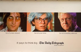
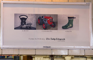
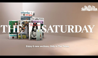
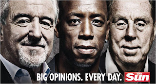
The generic conventions i have found are
- 1 main image
- Not alot of text
- Eyecatching
- Involves the newspaper website
- The general tone is serious
- Features the name of the newspaper with its logo
- The advert tells you what is unique about the newspaper
- They aren't gender or age specific
- They include prounouns to involve the audience
- 'Value for money' is a technique used to sell the newspaper
Thursday, 12 November 2009
Newspaper Language
Newspapers use specific language and grammar, this shows that it is newspaper text being read. Each newspaper follows a set of simple rules thats establishes the newpaper language. They are as follws:
The Nine Golden Rules
- KISS – Keep It Short and Simple. In any newspaper, whether it is national or local, keeping sentences short and simple makes better news and it is easier to read.
- Reading For Speed – Everything on a newspaper should be created for speed reading, enabling the audience to read through articles fast without hesitation or delay. Articles should be straight forward without any unnecessary text. This text should be reduced or cut out.
- Never Use 3 Words When One Will Do - This wil slow down the audiences reading and adds in useless text, meaning the rule of reading for speed is not followed.
- Don’t Repeat Yourself Use Active Verbs – e.g “Mother of three mugged”
- Use Puns In Headlines - Some humour lightens up the atmosphere of articles making the reader at ease and more likely to have a positive response to the article.
- Personalise The Story – Make it relevant to people and places. Audiences like to read articles that concern themselves as they feel more involved and are more likley to look out for articles that are relevant to themselves specifically.
- Categorise People – e.g Budding Businessman
- Avoid – Overuse of clichés, euphemisms, being too chatty, foreign phrases - This could lead to looking unprofessional and make difficult reading for the audience.
Grammar and quote use
When I am quoteing in articles, I need to make sure if the quote is direct or indirect. The use of grammar in articles changes compared with usual written text. A direct quote is something somebody has actually said. These need speech marks. Such as "It was a very useful and popular event" said Mrs Harper(36). Indirect quotes usually come after ' Mrs harper claimed the event was vey popular and useful'. This quote could have been taken from an outside/close source.Standard English grammar is often dropped when writing articles. This is because it makes the article easier to read, enabling reading for speed and in some cases can create a certain 'feel' to the article.
Text layout
Newspaper text is always written in columns that are aligned to reach both sides of the margins, covering the majority of the page, making them efficient and easy to read, as well as easy to quick read. Usually there are one to three sentences per paragraph, and font size is quite often small, around a size 8 or 10, so that alot of text can fit into the article, giving value for money and allow the article to have lots on content. The paragraphs are always indented to establish a different point, per paragraph. The establishing paragraph should always sum up the article, letting the reader know exactly all the information that will be included in the article. Newspapers sum this up my including specific point in the esablishing paragraph. These are:“WHO, WHAT, WHERE, WHEN and WHY”, this is written in short and ages are always shown after names. (Only in the first paragraph, unless introducing a new subject later on in the article). Text is mostly placed below or to the side of the photograph, if the article has one. It is rarely placed on top, as the headline is placed there.
Layout, typical features and technical terms
Some or all of these may be found on the front pages of newspapers.
Box-out – A small part of the page, shaded in a different colour.
By-line – The name of the reporter, if they are important is often included at the beginning of the feature, rather than at the end, or not at all.
Caption – Typed text under photographs explaining the image.
Credits – The author of a feature may be given credit in the form of a beeline. Photographs may have the name of the person who took them or the agency that supplied them alongside them.
Crosshead – This is a subheading that appears in the body of the text and is centred above the column of text. If it is se to one side then it is called a side-head.
Exclusive – This means that newspaper and no one else solely cover the story. The paper will pay their interviewees, buying the story so it cannot be used by another paper.
Feature – Not necessarily a ‘news’ item (current affairs), but usually with a human-interest angle presented as a spread.
Headline – This is the main statement, usually in the largest and boldest font, describing the main story. A banner headline spans the full width of the page.
Kicker – This is a story designed to stand out from the rest of the page by the use of a different font (typeface) and layout.
Lead Story - The main story on the front page, usually a splash.
Lure – A word or phrase directing the reader to look inside the paper at a particular story or feature.
Masthead – The masthead is the title block or logo identifying the newspaper at the top of the front-page. Sometimes an emblem or a motto is also placed within the masthead. The masthead is often set into a block of black or red print or boxed with a border; the ‘Red-tops’ (The Sun, The Mirror, The News of the World) are categorised by style and the use of a red background in the masthead.
Menu – The list of contents inside the paper.
Pugs – These are at the top left and right-hand corners of the paper and are known as the ‘ears’ of the page. The prices of the paper, the logo or a promotion are positioned there. They are well placed to catch the reader’s eye.
Secondary Lead – This is usually only a picture and headline, it gives a sneak preview of a story that you might find inside the paper.
Sidebar – When a main feature has an additional box or tinted panel along side of it.
Splash – The splash is the main story on the front of the paper. The largest headline will accompany this, along with a photograph.
Spread –A story that covers more than one page.
Standfirst – This is an introductory paragraph before the start of the feature. Sometimes it may be in bold.
Strapline – This is an introductory headline below the headline.
Tag – A word or phrase used to engage a reader’s interest in a story by categorising it e.g. ‘Exclusive’, ‘Sensational’
Wednesday, 11 November 2009
Comparison of a newspaper and its website
http://www.harrogateadvertiser.net/

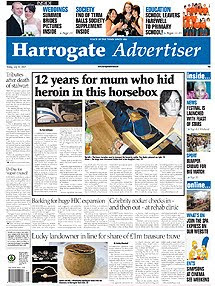
- On the newspaper website, the main article is reproduced exactly the same as it appears inthe actual newspaper.However there is an extra feature added which allows people to comment on the article.
- The main articles on the website change on a regular basis, which can be daily. However once the newspaper is published no articles can be changed.
- On the website there are extra articles that arent found in the newspaper, one being a feature of a horror film that isnt included anywhere in the newspaper.
- The website includes lots of interactive features such as leaving comments, posting letters to the editor and entering competitions.
- The website includes follow on articles, for example the newspaper had an article informing people of an upcoming rigby match, the website features the follow on article outline the match results.
- The website holds archives of much older articles that can be accessed if requested, however the newspaper only features an article once, and when thrown away cannot be viewed again.
- The website also includes a section informing people of whats on at the cinema for that week, the newsaper doesnt feature this section.
- The website contains hyperlinks on pages that lead to other articles and advertisements. the newspaper cannot have this feature
Cohesive devices of the Harrogate Advertiser newspaper and website
- There is clearly a house style followed throught the use of the colour scheme and font. The website layout follows the same style as the newspaper. It also has brand identity, featuring the newspaper logo on the website.
- The articles in the newspaper are generally the same as those featured on the Harrogate Advertiser website.
- The weather is featured on both the newspaper and website, however on the website it can be updated daily.
- Both still feature ulta local news from the Harrogate area, however the website also includes flash text at the top telling of national news.
Tuesday, 10 November 2009
Website Research
Harrogate Advertiser, Ripon Gazette, Wetherby News and Knaresborough Post are all produced by the same company Ackrill Media Group. All websites have the same layouts and generic conventions. This is why I looked into local newspapers from different areas to gather a much broader range of research into these generic conventions. I studied the websites of the following newspapers:
· Harrogate Advertiser
· Hereford Times
· Newcastle Journal
· North Wales Weekly News
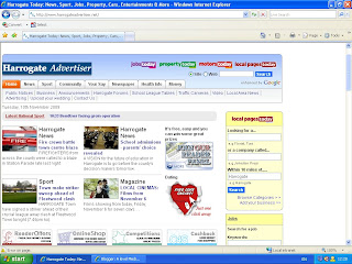
These are the generic conventions of the websites that i found:
- House style-Still keeps the blue colour scheme
- Brand Identity-Features the Harrogate Advertiser logo used on the newspaper
- Interactive options-allows people to comment on articles and newsletters
- Hyperlinked advertising-when clicked the reader is taken to its own website
- Weather forecast-linked with the actual newspaper
- Search engine-Allows people to search for a specific topic
- Online archives-Old articles available for people to view online
- Contact options-Makes it easy for someone to contact the newspaper via email
- Registration options-Log in/out, Register, allows people to sign up to newsletters etc
- Latest national news-Included at the top of the website in scrolling text that changes
- Job search-Linked with jobs avaiable in the newspaper
- Follow on articles-Some articles online following ones featured in other issues of the newspaper
- Extra articles-Some articles that arent featured in the newspaper at all
- Hyperlinks to sister newspapers-Allows the reader to also view other local news via the sister newspapers
- Article cateogories-Articles placed into cateogories to allow easier access for people wanting to view topic related articles
- Traffic guide-Keeps people up to date with the traffic flow and shows live video footage
- Forums-Allows people to discuss topics between themselves
Images
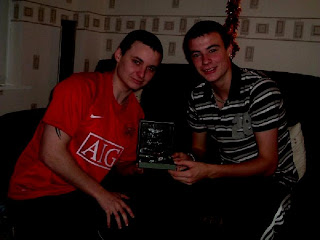
The end result was as follows:
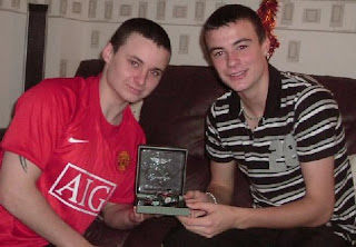
I used this programme for all of my images.
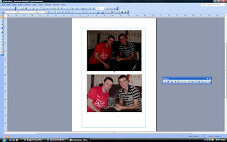
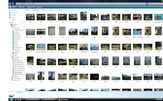
I took many images but only selected the best ones that would work well in my newspaper.A lot of the images were unused, but were good to practice editing.
Monday, 2 November 2009
Creating my newspaper
Stage One
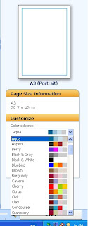
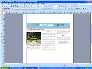
For the start of my newspaper I decided on my main article and name of the newspaper. I also created a complimenting colour scheme on blues, black and white. This will show the newspapers house style throughout the whole newspaper. The word ‘Harrogate’ is in bold and white to make it stand out more and show the audience exactly what local area the newspaper covers. I placed the article into columns to fill the width of the front page to show it is the main one with the most information. However the Masthead is too small.
Stage Two

At stage two I added another smaller article and put it into two columns to fill up my front cover. Some of the original article had to be cut to make it fit onto the page, but because of the topic sentence created, it still makes sense and has appropriate content.
Stage Three
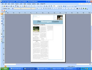
I then began to add images and text for my Strap line at the top of my newspaper. This is to show the readers what the inside of the newspaper features. This can sometimes be a selling point of a newspaper if there is a specific article somebody is interested in. It can also offer free giveaways which grabs people’s attention. I made the main article smaller and put into more columns to allow room for more articles on the front page.
Stage Four
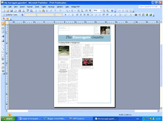
At this point I began to focus on the images used for my main article and decided that an image with people in is most likely to attract peoples attention and interest in the article, to see whom the article concerns and why. The text of the articles is made smaller to allow more room for images and other articles.
Stage Five

Another article is added that will interest the target audience and they will begin to see that the newspaper is value for money as lots of articles are included, with even more inside.
Stage Six
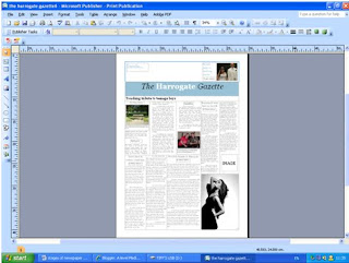
I then added a final article and highlighted that an image would accompany the article. I then decided to start creating an advertisement n the bottom corner of the newspaper, so that it wasn’t a focus point. The advertisement is for a local shop that would interest the local people. The image is in black and white which is a contrast to the other images, making them stand out more as they are brighter and have more colour and content.
Stage Seven

At stage seven I made the Masthead bigger to catch the audience’s attention as before it was too small and could barley be recognised as the headline of the main article. However it is at the centre of the page and the article is on the left hand side. I also carried on creating the advertisement for a local female clothes shop as from my questionnaire; the majority of readers are female.
Stage Eight

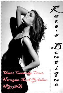
I then added a barcode, price and website address to my newspaper to make it professional and let the audience know the price, which was decided from the questionnaire I issued. I also added more text to the advertisement, letting people know where to find the local shop. The pink text stands out against the image so it is easily read.
Stage Nine

I tried making the main image of the main article bigger to attract people’s attention more. However an image of just a bench being the main image did not look appealing as it was very boring to look at and wouldn’t catch people’s attention.
Stage Ten
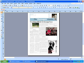
I decided the image in the main article of the two boys would be better being bigger as it would attracts peoples attention more and has more going on in the image for visual appeasement. The image of the bench was made smaller and the article made the width of the page again to cater for the larger image of the boys. This meant another article had to be removed.
Stage Eleven

I cropped the image for the main article to just feature the people concerned rather then the excess background so it is a close up shot of the boys faces. I deleted the picture of the bench to make room for it at the end of the article in a smaller space.
Stage Twelve
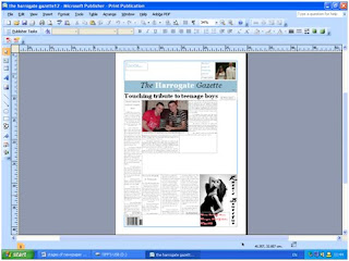
I then shuffled around the articles so that the columns matched up with other articles and are all running parallel with each other. This meant one article running the length of the page and the main article moved over to the right. I also moved the barcode to the bottom left of the newspaper to put next to a weather forecast.
Stage Thirteen
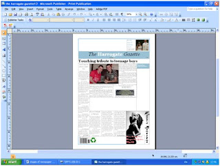
I then added in the recycling logo and price to the paper making it look more authentic. Instead of the image of the bench I cropped that image and featured just on the plaque.
Stage Fourteen

Then I added column lines in to define each article and made the images stand out against the writing. I also started creating weather forecast for my newspaper.
Stage Fifteen
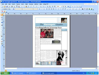

I changed the style of my weather forecast to just tell the days forecast rather than the weeks. I also added a section on how to contact the newspaper and what genres were featured inside and what pages they are on.
Stage Sixteen

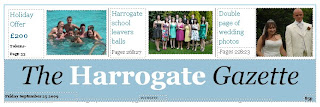
This is where I added promotions to the paper, otherwise known as plugs to interest the readers who buy the newspaper for the promotions and special features.
Stage Seventeen

On the right hand side I featured a column showing articles on the inside that could be of interest to specific people reading the newspaper. I decided to add images to make it more visually interesting.
Stage Eighteen
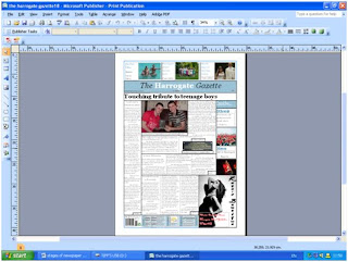
The last article was added to the front page of the newspaper filling all the gaps.
Stage Nineteen

Instead of having bold black lines dividing all of the articles, I made them softer to look at and not all continuous. They have small gaps at the top and bottom of the articles, creating a house style. The images still remained with a block outline. I also moved the main headline over to the centre of the page, over the top of the main article.
Stage Twenty
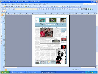
This shot shows how I made the Masthead of the newspaper bigger to stand out more. It also meant I could make my newspaper name bigger.
Stage Twenty-One

At this stage I shortened the article on the left hand side to make room for another smaller article to add more content to my newspaper. I also was still undecided about the layout for my main article and moved things around a bit. I also made the headline of the main article bigger to catch people’s attention. I also cropped one of the images at the top to focus more on the people in that image rather than their surroundings.
Stage Twenty-Two

I made the “Inside…” column on the right hand side, exactly the same width as the left side column as this is a common feature used in newspapers to have a symmetrical layout.
Stage Twenty-Three

I added in the final shorter article to my newspaper and decided where the image would be placed.
Stage Twenty-Four

I made the newspaper masthead bigger to fill more of the page, which makes it stand out more and become the focus of a viewers attention.
Stage Twenty-Five

I added in the last image to the article on the left hand side to finish off the front page of the newspaper.
I also followed a similar procedure when creating my second page.
First Stage

Final Stage
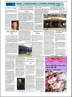
Between these stages i altered the page layout, created an index for people to look at and jump to a specific page. I also added an advert in the bottom right hand corner which follows generic conventions of a newspaper. Some articles had to be cut to add in smaller fillers. All the columns once again line up and there is a variety of images, mainly including people to create more of a response from the audience. There are lots of articles with different news values to interest every genre so that the newspaper isn't age or gender related.


