Stage One
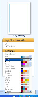
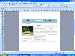
For the start of my newspaper I decided on my main article and name of the newspaper. I also created a complimenting colour scheme on blues, black and white. This will show the newspapers house style throughout the whole newspaper. The word ‘Harrogate’ is in bold and white to make it stand out more and show the audience exactly what local area the newspaper covers. I placed the article into columns to fill the width of the front page to show it is the main one with the most information. However the Masthead is too small.
Stage Two

At stage two I added another smaller article and put it into two columns to fill up my front cover. Some of the original article had to be cut to make it fit onto the page, but because of the topic sentence created, it still makes sense and has appropriate content.
Stage Three
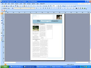
I then began to add images and text for my Strap line at the top of my newspaper. This is to show the readers what the inside of the newspaper features. This can sometimes be a selling point of a newspaper if there is a specific article somebody is interested in. It can also offer free giveaways which grabs people’s attention. I made the main article smaller and put into more columns to allow room for more articles on the front page.
Stage Four
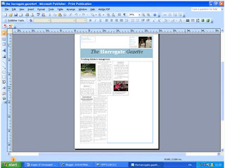
At this point I began to focus on the images used for my main article and decided that an image with people in is most likely to attract peoples attention and interest in the article, to see whom the article concerns and why. The text of the articles is made smaller to allow more room for images and other articles.
Stage Five

Another article is added that will interest the target audience and they will begin to see that the newspaper is value for money as lots of articles are included, with even more inside.
Stage Six
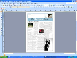
I then added a final article and highlighted that an image would accompany the article. I then decided to start creating an advertisement n the bottom corner of the newspaper, so that it wasn’t a focus point. The advertisement is for a local shop that would interest the local people. The image is in black and white which is a contrast to the other images, making them stand out more as they are brighter and have more colour and content.
Stage Seven

At stage seven I made the Masthead bigger to catch the audience’s attention as before it was too small and could barley be recognised as the headline of the main article. However it is at the centre of the page and the article is on the left hand side. I also carried on creating the advertisement for a local female clothes shop as from my questionnaire; the majority of readers are female.
Stage Eight

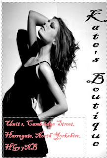
I then added a barcode, price and website address to my newspaper to make it professional and let the audience know the price, which was decided from the questionnaire I issued. I also added more text to the advertisement, letting people know where to find the local shop. The pink text stands out against the image so it is easily read.
Stage Nine

I tried making the main image of the main article bigger to attract people’s attention more. However an image of just a bench being the main image did not look appealing as it was very boring to look at and wouldn’t catch people’s attention.
Stage Ten
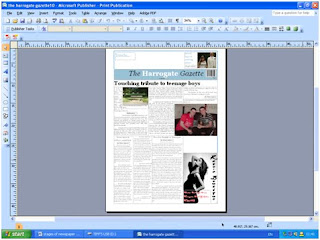
I decided the image in the main article of the two boys would be better being bigger as it would attracts peoples attention more and has more going on in the image for visual appeasement. The image of the bench was made smaller and the article made the width of the page again to cater for the larger image of the boys. This meant another article had to be removed.
Stage Eleven

I cropped the image for the main article to just feature the people concerned rather then the excess background so it is a close up shot of the boys faces. I deleted the picture of the bench to make room for it at the end of the article in a smaller space.
Stage Twelve
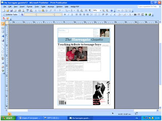
I then shuffled around the articles so that the columns matched up with other articles and are all running parallel with each other. This meant one article running the length of the page and the main article moved over to the right. I also moved the barcode to the bottom left of the newspaper to put next to a weather forecast.
Stage Thirteen
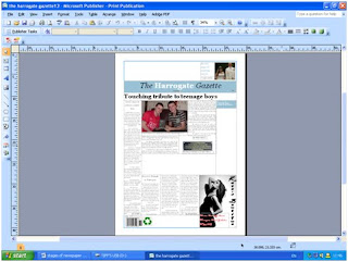
I then added in the recycling logo and price to the paper making it look more authentic. Instead of the image of the bench I cropped that image and featured just on the plaque.
Stage Fourteen

Then I added column lines in to define each article and made the images stand out against the writing. I also started creating weather forecast for my newspaper.
Stage Fifteen
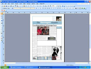

I changed the style of my weather forecast to just tell the days forecast rather than the weeks. I also added a section on how to contact the newspaper and what genres were featured inside and what pages they are on.
Stage Sixteen

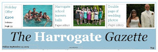
This is where I added promotions to the paper, otherwise known as plugs to interest the readers who buy the newspaper for the promotions and special features.
Stage Seventeen

On the right hand side I featured a column showing articles on the inside that could be of interest to specific people reading the newspaper. I decided to add images to make it more visually interesting.
Stage Eighteen
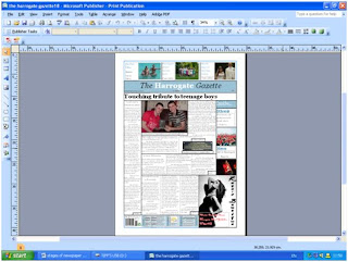
The last article was added to the front page of the newspaper filling all the gaps.
Stage Nineteen

Instead of having bold black lines dividing all of the articles, I made them softer to look at and not all continuous. They have small gaps at the top and bottom of the articles, creating a house style. The images still remained with a block outline. I also moved the main headline over to the centre of the page, over the top of the main article.
Stage Twenty
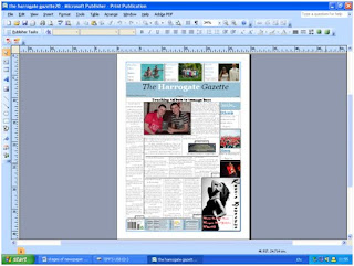
This shot shows how I made the Masthead of the newspaper bigger to stand out more. It also meant I could make my newspaper name bigger.
Stage Twenty-One

At this stage I shortened the article on the left hand side to make room for another smaller article to add more content to my newspaper. I also was still undecided about the layout for my main article and moved things around a bit. I also made the headline of the main article bigger to catch people’s attention. I also cropped one of the images at the top to focus more on the people in that image rather than their surroundings.
Stage Twenty-Two

I made the “Inside…” column on the right hand side, exactly the same width as the left side column as this is a common feature used in newspapers to have a symmetrical layout.
Stage Twenty-Three

I added in the final shorter article to my newspaper and decided where the image would be placed.
Stage Twenty-Four

I made the newspaper masthead bigger to fill more of the page, which makes it stand out more and become the focus of a viewers attention.
Stage Twenty-Five

I added in the last image to the article on the left hand side to finish off the front page of the newspaper.
I also followed a similar procedure when creating my second page.
First Stage

Final Stage
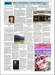
Between these stages i altered the page layout, created an index for people to look at and jump to a specific page. I also added an advert in the bottom right hand corner which follows generic conventions of a newspaper. Some articles had to be cut to add in smaller fillers. All the columns once again line up and there is a variety of images, mainly including people to create more of a response from the audience. There are lots of articles with different news values to interest every genre so that the newspaper isn't age or gender related.
No comments:
Post a Comment