Tuesday, 5 January 2010

Poster Audience Feedback


Website Audience Feedback


Newspaper Audience Feedback

Front Page

Second Page


Technological devices used to create my final pieces

  • Google
  • Paint
  • Microsoft Office Live Small Business
  • Microsoft Office Publisher
  • Microsoft Office Word
  • Blogger

Final Newspaper Articles

British Bridal Exhibition returns to Harrogate
ONCE again the British Bridal exhibition returned to Harrogate and hundreds of excitable brides flocked to purchase their dream dresses. From the 13th-15th September the exhibition was held at the Harrogate International Centre where many top wedding dress desi9gners exhibited their new collections.
The exhibition is organised by the Ocean Media Group Limited who acquired the rights to the British Bridal Exhibition in Harrogate (BBEH) in 1999. The event takes place twice a year and is timed to meet the rush for summer and winter weddings which are the most popular timeslots for weddings. Over the years the event has expanded in both exhibitors and visitors, it has quickly become an international event with thousands visiting Harrogate to attend.
In March 150 exhibitors showcased more than 220 collections over 10,000 square metres. It attracted around 2500 unique bridal buyers. The event this time round in September saw 220 exhibitors showcase more than 330 collections in over 13,000 square metres of space, attracting over 3600 buyers. It was a huge event which had a lot of publicity and press.
Claire Parish, a visitor said “The dresses I’ve seen today are absolutely stunning, and I have found the perfect dress for my wedding. If it wasn’t for events like these I would be stuck looking at bridal magazines and not see the beauty and elegance of the dresses for myself.”
The event also offered blushing brides the chance to view bridesmaid collections. There was lots of support from staff recommending colour schemes and decorations. The men were certainly not left out. They had their own personal shoppers who helped to pick and tailor suits for the soon to be grooms, which would compliment their weddings style and theme.
As well as organising these magnificent bridal events, Ocean Media Group Limited also produces the Bridal Buyer Magazine which is the main source of bridal industry news in the UK. The company were said to be ‘thrilled’ with the turnout and success of the event and have said “The bridal market is continuously growing. There has never been a dip in the market which goes to show that the recession doesn’t dampen a bride’s enthusiasm.”
Tiffany Jackson


Harrogate hotel best in the UK

HOTEL Du Vin of Harrogate was voted as the best hotel in the UK according to the Sunday Times Travel Magazine published this month. The hotel which overlooks Harrogate Stray beat competition form other top hotels around the country such as Hotel Tresantan, Cornwall, a luxurious five star hotel which is a favourite of many celebrities such as Elton John and Johnny Depp.
The general manager Nick Dawson is said to be ‘ecstatic and relieved’ after all the hard work that the staff put in to making the hotel the best it can possibly be. It is also another award to hang on their wall. Nick Dawson was happy with the hotel being awarded the best hotel in Harrogate but he feels ‘honoured’ to run such a high standard hotel that is now the best in the UK. He said “The hotel could not have achieved such an award without the dedication and support off all the staff here. They really are fantastic.”
Hotel Du Vin has always offered luxury and elegance. It was created in 1778 by an Act of Parliament, in a registered building that can never be knocked down. It houses forty-eight bedrooms featuring pristine beds of luxurious Egyptian cotton, monsoon showers with stylish furnishings and unique décor. Included are airy loft suites with private balconies overlooking the beauty of the Harrogate Stray. As well as these beautiful rooms the hotel offers spa treatments such as full body massages and sea weed wraps. Their staff are fully trained to offer the best service possible. In addition the hotel also has its very own restaurant that already has its own awards for the quality of their food.
A frequent visitor of the hotel, Maria Swan said “When visiting Hotel Du Vin it is clear to see just exactly why they have achieved such an award as everything is spot on which is what I expect from a hotel in such a lovely area. I want to be able to relax and rely on the hotel to deliver the best standards, which is certainly what this hotel does, and more.”

Tiffany Jackson


High class jewellers involved in insurance scam

BRADLEY’S of Harrogate suffered at the hands of a terrible fire on the 22nd August of this year. The delay reopening of the store has created speculation that the fire was an insurance scam and fire investigators are currently investigating the fire further. One month on and refurbishment of Bradley’s has still not commenced and their website www.bradleysofharrogate.co.uk has temporarily been shut down.
The store has been up and running since the 1970’s but has been struggling recently due to the current economic situation. An anonymous source said “It may have been in Bradley’s interests for the fire to occur because of the current financial climate people are less willing to part with their money. Bradley’s operates in a Niche market and charges high prices for their luxurious items which people simply cannot afford.”
The fire broke out in Bradley’s basement and fire engines form Harrogate and Knaresborough rushed to the scene to battle the fire after being alerted by staff members, they had been evacuated as quickly as possible along with the staff from the buildings on either side of the store. The fast actions of the fire services meant they were able to control the incident and the fire was confined to the rear of the building in an area of about 10m by 5m meaning there was little damage caused in the building which has historic value.
People are beginning to wonder why Bradley’s is taking so long to reopen given the small scale of the damage. The anonymous source said “it certainly looks like it could be an insurance scam to help them with their money struggles.” The management of Bradley’s refused to comment on the fire and accusations.
If the investigation proves that the fire was an insurance scam then matters will ne handed over to the police who will deal with the situation.

Tiffany Jackson


Local man in critical condition
A LOCAL man from the Harrogate area has been taken to Leeds General Infirmary last night after he was left in a critical condition following a hit and run. The incident occurred at 8.25pm when James Moore (29) was riding his motorbike along the Knaresborough bypass, when he was suddenly knocked off his bike by a car.
Hero of the hour Mark Slater was driving by and saw the biker at the side of the road. Mark put James into the recovery position and kept him warm until the ambulance arrived to take him to Harrogate District Hospital where he was attended to by doctors who commended Mark for his quick thinking and actions which saved the life of Mr Moore.
Mr Moore is currently in a coma fighting for his life after suffering from severe head injuries and a sever fracture to his spine which if he awakes from his coma, could leave him with permanent difficulties. He is currently on a life support under 24 hour care by the nurses at LGI. Doctors have said ‘his condition is very serious and they are doing the best they can for him.’
Dr Wells, head of the neurology department at LGI said “We’re taking it one step at a time. When he wakes from his coma which is a strong possibility, we will be able to see the extent of the damage caused to his spine and do everything possible to make his life after this accident comfortable. He had slight bleeding of the brain which was able to be controlled at Harrogate hospital. However it has left him with slight brain damage which has slowed down his reactions and learning abilities.”
Mr Moore’s wife is said to be ‘distraught and lost without her husband’. Susan Moore was unavailable to comment as she hasn’t left her husbands bedside. The police are searching for other witnesses to come forward. PC Giles has said “It is extremely important that if you witnessed this accident or were the car that knocked Mr Moore off his bike; you need to come forward and give information immediately, so the police services can understand what happened and why. This really brings to light the Think, Bike, campaign. The accident should be an eye opener to Harrogate motorists and remind them to look twice for bikes.”
If you were a witness to this accident please call 01423 673421
Tiffany Jackson


New canteen at HGS

LAST week saw students returning to school. As well as new faces students at Harrogate Grammar School saw a new building too. The new building named ‘The Hub’ is the newest addition to the ongoing work at the school. It is an extension of the current school canteen and provides. One teacher commented that the new canteen was ‘A much greater capacity for pupil’s lunches’.
The building work commenced at the end of May and was completed just days before the school reopened, costing a staggering £250,000. Steve Howell, the schools Business Manager said “Most of the money for the dining facilities came form North Yorkshire County Council following our bid. As such we could not have spent this money on other things. It was ‘special’ money for a special purpose.” The Hub has led to more seats and a reduced queuing time for pupils. The acoustics of the building are better as well as it being light and airy. The décor is modern and not cramped allowing it to be easily accessible.
The school is also investing £360,000 on becoming a specialist training school as well as spending £2m on 8 new classrooms, an extension of the sixth form block and a purpose built learning theatre. Building work will commence in October and will be completed in time for the autumn term 2010. Mr Howell said “Better facilities will improve students learning opportunities and make the school a more attractive place for students and staff.” The money for the new extensions is this time from the Government via the Learning and Skills Council in order for the school to create some facilities that they do not currently have.
The school is already over subscribed and is one of the top 20 schools in the UK. When these facilities become available it will more than likely become a first place choice for many parents of local primary school pupils as their children are sure to achieve excellent results with the help and support offered by the school.
Tiffany Jackson


The great Tesco debate
HARROGATE is the last UK mainland postcode area to not have a Tesco mega store. Since November 2007 when planning permission was filed by Tesco to the Harrogate council which was declined, debate about this issue has raged.
Since then Tesco has filed even more proposals in order for the mega store to be built at New Park off Skipton Road. The latest application to be filed was on the 3rd of July, this year. Tesco want the application to be passed by mid October in order for the building work to commence. The proposal has some changes to it in order to keep the peace such as reduction of the retail space by 25% and making the store environmentally formatted to reduce energy consumption. Tesco also claim that the store will provide 360 new jobs for local people that lead to career development opportunities. A spokesperson for Tesco said “The new store will be cleaning up an eyesore by rejuvenating the Oak Beck area and bringing a public footbath back into use. It will offer hundreds of jobs as getting a job at the moment is quite a struggle with barely any work available in Harrogate. It will also make it easier for the local people to do their food shopping as they won’t have to travel into the town centre.”
A source claims “Harrogate council would allow it if they believed the community wouldn’t be in uproar about it.” Many community members are strongly against the idea with an online poll showing 44% for Tesco and 56% against it. Many people say ‘Harrogate is unique. We should keep it that way’. May Taylor (63), a local from the New Park community said “It will ruin New Park and the store itself will be the eyesore. New park is lovely as it is now and there are enough supermarkets in Harrogate for people to make their purchases. It will cause problems in the area as Skipton Road is already a busy road and to make it busier is mad. It’ll be gridlocked all the time.”
Harrogate council are still considering the latest application. In the mean time debating on the Tesco debate website has increased as opposition group’s marshal their support.

Tiffany Jackson


Touching tribute to teenage boys

THREE benches have been erected on Pannal Green in memory of three teenage boys from Harrogate who were killed in a car collision at the beginning of this year.
The Pannal community raised just over £3000 for the purchase of the benches which feature their own plaques dedicated to the boys. The benches are situated on Pannal Green as this is where these three young men spent their childhood playing football and spending time with their friends and family.
Craig Rayiru(19) and Joseph Wilson(18) were killed instantly in a horrific car accident on the 27th January of this year. They were on their way to a football match in a Citreon Saxo on the A661 near Spofforth. The car was involved in a head on collision with a Skoda Felicia driven by Howard Catley(49) who was rushed to hospital with serious injuries but later passed away. Daniel Rayiru(17) brother of Craig remained in intensive care with traumatic head injuries for seven days before his parents decided it would be best to turn off his life support. He passed away six days after his 17th birthday.
A neighbour Pat Ainslie said “The boys were a big part of the Pannal community. They were several people’s paper boys, and we had watched them grow up from boys to young men. When the accident occurred the whole of Pannal was in mourning at such a loss. These benches are a tribute to their lives and a place to go for friends and family to remember the boys. As well as the benches we want to have fairy lights strung up in the trees to light them up.”
The families of the boys are said to be ‘touched and grateful’ for all the support that the Pannal community has offered. Over the past few months that have been going through a difficult time, with one family losing two sons. Louise Rayiru commented that “It’s nice to see that people care and are pulling together and offering us support at this extremely difficult time.”
The inquest of this case will be held next Tuesday at Harrogate magistrate’s courts.

Tiffany Jackson


Bus service mayhem

AUGUST the 30th saw major changes to the bus services in Harrogate. Transdev have made huge cutbacks to bus schedules and bus routes have been made shorter as the company has seen a fall in profits and passenger numbers since the beginning of the year. This has caused mayhem to the local community as many people say they have been left ‘isolated’ by the cuts to routes, especially the 106 service to Pannal Ash
A lot residents have been left in confusion, with many not knowing of the changes of times and routes, meaning they are late to work or meetings. Ian Shears (56), a member of the Pannal Ash Community Club said “ A lot of the current route has been taken out such as Green Lane and Yew Tree Lane, meaning a lot of people have to walk far to catch the bus. Transdev are not bearing in mind that we have a lot of elderly residents in this area and to make them walk for fifteen minutes to catch a bus is an outrage.”
As well as the service changes the bus numbers have also been changed which has also caused a lot of trouble. Lots of people have even boarded the wrong bus and got off at the wrong destination. Edith Hunter (67), a local resident said “I was at the bus station and wanted to get the bus home to my house in Jennyfields, because all the numbers have changed I got confused and ended up getting a bus that took me to Knaresborough. It was very distressing for me as I had no idea where I was and how to get home.”
Transdev have been urged to reinstate some of the services, mainly the Pannal Ash route and late night buses to New Park. Harrogate county council have written to the company asking them to do so at busy times of the day such as mid morning and mid afternoon. The local people of Harrogate have support around them from all areas and are sure to keep pushing Transdev to return to the normal bus services.
Tiffany Jackson


Possible Primark in Harrogate

Over the past few months there has been a lot of speculation about what shop will grace Harrogate with its presence in the old boots retail unit, which has been empty since mid August due to the relocation of the store to the old Woolworths unit. Such names that have cropped up are Topman, House of Fraser, Bank Fashion and Primark. The least expensive of them all, Primark is said to be most likely to be purchasing the unit.
Primark is best known for its cheap fashion clothing and keeping up to the trend on Britain's high street last year to make a £233m profit. For hundreds keen on fashion at a cheap price, the store will be a godsend, but others think it will make Harrogate look cheap and have lower standards. Primark has been in the news a lot recently over its supplier TNS Knitwear are employing illegal workers who work 12 hours a day, 7 days a week for just £3 an hour when adult minimum wage is £5.73 an hour. A previous investigation also uncovered the Primark contractors were employing children in slum workshops in India. Primark were said to be ‘very concerned by these allegations and care about the welfare of their workers.’ Primark’s website states ‘Primark is committed to providing the best possible value for our customers, but not at the expense of the people who make our products.’
Primark was originally founded in 1969 in Dublin and originally named Penney’s. Since then they have opened 191 stores in the Europe and the company wanted to deliver quality fashion items at a reasonable price, which is how the company came to light. It is unknown how the possible store in Harrogate will be received as from past headlines people have become more aware of Primark behind the scenes and are worried about the impact it will have on people’s views of Harrogate.
Tiffany Jackson


Harrogate hockey player 4th in the UK
James Bottemly (19) is gradually moving up the top five list of hockey players in the UK.
James has now been named 4th in the country after he began playing the sport age 11 at secondary school. He said “ It feels great to be commended for playing the sport after putting so much time and effort into it. I now play for Britain under 20’s which is quite an achievement.”

Tiffany Jackson


Library extension
The new extension to the old Harrogate Library is now underway with the contractors stating it will be open in time for a Christmas unveiling.
The extension of the library is costing a staggering £2.2m to update the facilities and bring it into the 21st century. Building work commenced last week of the new computer room which will allow people to scroll through online archives both old and new. The extension will be built as similar to the original building itself to keep the feeling of old knowledge and blend in with the historic building.
Pam Thornton (52), Head Librarian said “We are very excited about the new extension of the library as we feel it will attract younger generations who will then become more interested in books again. It allows us to become modern but also keep our old values.”
Phil Willis, MP said “The money the council have spent on the library is a good investment as although it isn't a school, it still educates people and we want young people to be able to go to the library and enjoy themselves whist learning.”
The date of the grand reopening will be the 21st December 2009. Tickets can be purchased from our website.

Tiffany Jackson


Mother of 3 mugged
Caroline Simpson (32) of King Edwards Drive was mugged by a group of teens as she collected her 3 children from school.
The attack took place in broad daylight at 3.45pm when the family were walking home along Dixon Terrace. The group of teen approached Caroline and ordered her to give them her bag. When she refused they knocked her over in front of her children and punched her in the face before grabbing her bag and ran in the opposite direction towards the town centre. A source said “Mrs Simpson is very shaken and vulnerable after the attack.”

Tiffany Jackson

News Values

Alistair Hetherington, the former editor of The Guardian used news values to set a criteria to determine which audience will read which article and what the article topics would be. He created 10 values:
1) Social Significance

2) Political Significance

3) Economic Significance

4) Human Significance

5) Drama

6) Suprise

7) Proximity

8) Personalities

9) Sex/Scandal/Crime

10) Numbers


I have created a table for my newspaper. It includes the articles that will be featured in my newspaper, who the target audience is, what news values are included and if an image will be included.

Newspaper Website Production and Evaluation

My newspaper website is:


This is the final version of my Home Page on my website. It has lots of generic features such as a Google search engine as well as local search engines. It also includes the front page article as well as different genres of articles for people to click on to link them to another page. At the top i made "Jobs Today, Property Today" etc for people to click on as this is a generic convention of local newspapers as it is local advertising. There is also a weather forecast further down with local adverts and access to archives. At the top of the page are tabs for the viewer to click on regarding what type of articles they are searching for. It also has scrolling text featuring the local headlines. The website includes some articles that aren't featured in the newspaper. It also offers contact options for the audience to get involved with the newspaper and have their say. However most importantly the webiste follows the same House Style as the newspaper and includes Brand Identity by featuring the Harrogate Gazette logo.

When clicking on the first article "Touching tribute to teenage boys" it takes the viewer to the following page:

On this page is the full article and gives the viewer the opportunity to interact with it by allowing them to comment on it, make it larger and even email it to a friend. The article includes the same image in the newspaper as well as a caption for it. All the pages on the website follow the House Style of the newspaper. On the left hand side is the website browser, which when clicked will take the viewer to different sections of the newspaper. On the right hand side are more articles which are the most viewed, allowing the viewer to see the most up to date articles and how popular they are. Further down the page is an advert for a local newspaper which would be hyperlinked to its homepage.


My second hyperlink is on the sports story which will then take the viewer to the sports page:

This page features all the recent sports articles which are then hyperlinkedto other pages when the article is clicked on. Once again this page includes the website browser on the left hand side so the viewer can navigate away from the page easily.


My last hyperlink is the "Contact Us" button at the bottom of the home page. This takes the viewer to a page with the contact details of the newspaper:

This allows the viewer to voice their own opinion about the newspaper and its articles.


I created my search engines using Microsoft Office Publisher


My final posters

Poster 1

This poster is very simple with just a play with words and colours. However it is eye-catching as it is abstract. It also features a slogan for the newspaper saying "The Harrogate Gazette ... It's got something for everybody" The colours are neutral but give the poster variety which is what the newspaper offers therefore backing up the slogan on the advert. It also features the newspapers website to promote it further, which is a well known generic convention of newspaper adverts. The advert tells the audience what is unique about the newspaper and that is the variety of stories found in it. The advert isn't aimed at a specific genre, it is aimed at everybody. There is little text used that differs from the newspaper name, so that the audience doesn't lose interest.


Poster 2

This poster focus more on images. Instead of just saying "...It's got something for everybody" is shows just who that everybody is.There is alot of variety with the people used from old to young and male and female, therefore the poster isnt aimed at a specific genre.The advert once again features a slogan and the newspaper website as well as the newspaper name and logo. It is eye-catching but not too vibrant.There is little text used to keep the audience's interest.

Wednesday, 2 December 2009

Block layout for newspaper advert.

For my advert i decided that i would show the community that it is not just specific stereotypes that read The Harrogate Gazette. I want to show them who else reads the newspaper so decided that i wanted lots of images of different kinds of people e.g ages, genders, social status's. The images will all have the people reading my newspaper and my slogan will be The Harrogate Gazette...Its got something for everybody. I also want my newspaper website advertised to.Here is my first attempt on the layout:
This layout is a bit complex. It follows my newspaper colour scheme but is nto simple like other newspaper adverts that normally follow the generic convention of keeping their adverts simple and to the point. There is a lot of unused space thoughtwhich can be reduced if the layout were changed.

The second layout proved to be more successful.
This layout has good use of space and isnt too complex as there is little colour. However more colour will be added when the images are slotted in. This layout also captivates the viewers attention with the use of images and finally draws their eyes down to the newspaper logo, slogan and website. It is also clearer because I know what image goes where. Overall it is a much better layout because of the how the viewer sees it and is drawn to the important information without being too vibrant and 'busy'.

Monday, 30 November 2009

Generic conventions of newspaper advertisements

There are very few advertisements for an actual newspaper itself which made it difficult to find these images.
Each advertisement follows some of the same conventions when portraying their newspaper

The Guardian
The Guardian uses bright colours and abstract images to grab the viewers attention, giving the newspaper personality, rather than just bein dull and boring, which most newspaper are stereotyped as. This means the images will appeal to the younger generation. Althought the colours are bright they are quite neutral as they arent aimed at just one gender, they are aimed at both. The advertisements always feature The Guardian logo. They encourage the viewer to make their own opinions from the facts that are given in the newspaper which makes people want to read the newspaper as they can be interactive with it.


The Daily Telegraph
The Daily Telegraph looks more sophisticated and would appeal to the older generation. The background colours are very neutral making it non gender specific, helping to give it a serious feel. The images are of celebrities that the older generation would relate to and recognise. In both advertisements the newspaper uses the same slogan "It pays to think big" showing that people and things have developed into greater things which is what the newspaper wants its readers to do, become something because of the stories they have read, etc.


The Times
The times uses simple images and neutral colour schemes so the advertisement isn't aimed at a specific gender or age. The advertisements include the logo and same font as the logo on slogans and text. The second advert is more likely to grab somebodies attention as it is an emotional image, like an emotional plea to the readers.


The Sun
The Sun advertisements focus more on value for money rather than the stories included in the newspaper. The till reciept is especially effective as people are interested in value for money. This image shows readers exactly what they can get for 30p. The adverts include The Sun logo. It also uses images of people that the readers can relate to. The colours are quite dull and neutral which then really make The Sun logo stand out.


The generic conventions i have found are

  • 1 main image
  • Not alot of text
  • Eyecatching
  • Involves the newspaper website
  • The general tone is serious
  • Features the name of the newspaper with its logo
  • The advert tells you what is unique about the newspaper
  • They aren't gender or age specific
  • They include prounouns to involve the audience
  • 'Value for money' is a technique used to sell the newspaper
In conclusion all the newspaper follow similar conventions in order to captivate the audience and get them to purchase their newpaper. They do this by using simple advertisement techniques and neutral colours, making the adverts appeal to all types of people no matter what their age or gender. The adverts focus on what the newspapers have to offer and value for money. All the adverts contain bold titles to grab peoples attention, but then little text so they dont lose interest.

Thursday, 12 November 2009

Newspaper Language

Newspaper Language
Newspapers use specific language and grammar, this shows that it is newspaper text being read. Each newspaper follows a set of simple rules thats establishes the newpaper language. They are as follws:


The Nine Golden Rules


  • KISS – Keep It Short and Simple. In any newspaper, whether it is national or local, keeping sentences short and simple makes better news and it is easier to read.

  • Reading For Speed – Everything on a newspaper should be created for speed reading, enabling the audience to read through articles fast without hesitation or delay. Articles should be straight forward without any unnecessary text. This text should be reduced or cut out.

  • Never Use 3 Words When One Will Do - This wil slow down the audiences reading and adds in useless text, meaning the rule of reading for speed is not followed.

  • Don’t Repeat Yourself Use Active Verbs – e.g “Mother of three mugged”

  • Use Puns In Headlines - Some humour lightens up the atmosphere of articles making the reader at ease and more likely to have a positive response to the article.

  • Personalise The Story – Make it relevant to people and places. Audiences like to read articles that concern themselves as they feel more involved and are more likley to look out for articles that are relevant to themselves specifically.

  • Categorise People – e.g Budding Businessman

  • Avoid – Overuse of clichés, euphemisms, being too chatty, foreign phrases - This could lead to looking unprofessional and make difficult reading for the audience.


Grammar and quote use

When I am quoteing in articles, I need to make sure if the quote is direct or indirect. The use of grammar in articles changes compared with usual written text. A direct quote is something somebody has actually said. These need speech marks. Such as "It was a very useful and popular event" said Mrs Harper(36). Indirect quotes usually come after ' Mrs harper claimed the event was vey popular and useful'. This quote could have been taken from an outside/close source.Standard English grammar is often dropped when writing articles. This is because it makes the article easier to read, enabling reading for speed and in some cases can create a certain 'feel' to the article.

Text layout

Newspaper text is always written in columns that are aligned to reach both sides of the margins, covering the majority of the page, making them efficient and easy to read, as well as easy to quick read. Usually there are one to three sentences per paragraph, and font size is quite often small, around a size 8 or 10, so that alot of text can fit into the article, giving value for money and allow the article to have lots on content. The paragraphs are always indented to establish a different point, per paragraph. The establishing paragraph should always sum up the article, letting the reader know exactly all the information that will be included in the article. Newspapers sum this up my including specific point in the esablishing paragraph. These are:“WHO, WHAT, WHERE, WHEN and WHY”, this is written in short and ages are always shown after names. (Only in the first paragraph, unless introducing a new subject later on in the article). Text is mostly placed below or to the side of the photograph, if the article has one. It is rarely placed on top, as the headline is placed there.

Layout, typical features and technical terms

Some or all of these may be found on the front pages of newspapers.

Box-out – A small part of the page, shaded in a different colour.

By-line – The name of the reporter, if they are important is often included at the beginning of the feature, rather than at the end, or not at all.

Caption – Typed text under photographs explaining the image.

Credits – The author of a feature may be given credit in the form of a beeline. Photographs may have the name of the person who took them or the agency that supplied them alongside them.

Crosshead – This is a subheading that appears in the body of the text and is centred above the column of text. If it is se to one side then it is called a side-head.

Exclusive – This means that newspaper and no one else solely cover the story. The paper will pay their interviewees, buying the story so it cannot be used by another paper.

Feature
– Not necessarily a ‘news’ item (current affairs), but usually with a human-interest angle presented as a spread.

Headline – This is the main statement, usually in the largest and boldest font, describing the main story. A banner headline spans the full width of the page.

Kicker – This is a story designed to stand out from the rest of the page by the use of a different font (typeface) and layout.

Lead Story - The main story on the front page, usually a splash.

Lure – A word or phrase directing the reader to look inside the paper at a particular story or feature.

Masthead – The masthead is the title block or logo identifying the newspaper at the top of the front-page. Sometimes an emblem or a motto is also placed within the masthead. The masthead is often set into a block of black or red print or boxed with a border; the ‘Red-tops’ (The Sun, The Mirror, The News of the World) are categorised by style and the use of a red background in the masthead.

Menu
– The list of contents inside the paper.

Pugs – These are at the top left and right-hand corners of the paper and are known as the ‘ears’ of the page. The prices of the paper, the logo or a promotion are positioned there. They are well placed to catch the reader’s eye.

Secondary Lead – This is usually only a picture and headline, it gives a sneak preview of a story that you might find inside the paper.

Sidebar – When a main feature has an additional box or tinted panel along side of it.

Splash – The splash is the main story on the front of the paper. The largest headline will accompany this, along with a photograph.

Spread –A story that covers more than one page.

Standfirst – This is an introductory paragraph before the start of the feature. Sometimes it may be in bold.

Strapline – This is an introductory headline below the headline.

Tag – A word or phrase used to engage a reader’s interest in a story by categorising it e.g. ‘Exclusive’, ‘Sensational’

Wednesday, 11 November 2009

Comparison of a newspaper and its website

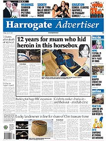
The Harrogate Advertiser


http://www.harrogateadvertiser.net/


  • On the newspaper website, the main article is reproduced exactly the same as it appears inthe actual newspaper.However there is an extra feature added which allows people to comment on the article.
  • The main articles on the website change on a regular basis, which can be daily. However once the newspaper is published no articles can be changed.
  • On the website there are extra articles that arent found in the newspaper, one being a feature of a horror film that isnt included anywhere in the newspaper.
  • The website includes lots of interactive features such as leaving comments, posting letters to the editor and entering competitions.
  • The website includes follow on articles, for example the newspaper had an article informing people of an upcoming rigby match, the website features the follow on article outline the match results.
  • The website holds archives of much older articles that can be accessed if requested, however the newspaper only features an article once, and when thrown away cannot be viewed again.
  • The website also includes a section informing people of whats on at the cinema for that week, the newsaper doesnt feature this section.
  • The website contains hyperlinks on pages that lead to other articles and advertisements. the newspaper cannot have this feature

Cohesive devices of the Harrogate Advertiser newspaper and website

  • There is clearly a house style followed throught the use of the colour scheme and font. The website layout follows the same style as the newspaper. It also has brand identity, featuring the newspaper logo on the website.
  • The articles in the newspaper are generally the same as those featured on the Harrogate Advertiser website.
  • The weather is featured on both the newspaper and website, however on the website it can be updated daily.
  • Both still feature ulta local news from the Harrogate area, however the website also includes flash text at the top telling of national news.


Tuesday, 10 November 2009

Website Research

For part two of the coursework, which is create a website for my newspaper with two hyperlinked pages I need to research the generic conventions of other local newspaper websites to see how the website presents itself and how it is interlinked with the actual newspaper itself.

Harrogate Advertiser, Ripon Gazette, Wetherby News and Knaresborough Post are all produced by the same company Ackrill Media Group. All websites have the same layouts and generic conventions. This is why I looked into local newspapers from different areas to gather a much broader range of research into these generic conventions. I studied the websites of the following newspapers:
· Harrogate Advertiser
· Hereford Times
· Newcastle Journal
· North Wales Weekly News


These are the generic conventions of the websites that i found:
  • House style-Still keeps the blue colour scheme

  • Brand Identity-Features the Harrogate Advertiser logo used on the newspaper
  • Interactive options-allows people to comment on articles and newsletters

  • Hyperlinked advertising-when clicked the reader is taken to its own website

  • Weather forecast-linked with the actual newspaper

  • Search engine-Allows people to search for a specific topic

  • Online archives-Old articles available for people to view online

  • Contact options-Makes it easy for someone to contact the newspaper via email

  • Registration options-Log in/out, Register, allows people to sign up to newsletters etc

  • Latest national news-Included at the top of the website in scrolling text that changes

  • Job search-Linked with jobs avaiable in the newspaper

  • Follow on articles-Some articles online following ones featured in other issues of the newspaper

  • Extra articles-Some articles that arent featured in the newspaper at all

  • Hyperlinks to sister newspapers-Allows the reader to also view other local news via the sister newspapers

  • Article cateogories-Articles placed into cateogories to allow easier access for people wanting to view topic related articles

  • Traffic guide-Keeps people up to date with the traffic flow and shows live video footage

  • Forums-Allows people to discuss topics between themselves


Images

I edited my images using Microsoft Publisher, to brighten and crop the images to give a better visual effect.For example on my front page i brightened and cropped the following image:

The end result was as follows:

I used this programme for all of my images.

I took many images but only selected the best ones that would work well in my newspaper.A lot of the images were unused, but were good to practice editing.

Monday, 2 November 2009

Creating my newspaper

I created my newspaper in Microsoft Publisher, once I had my article ideas and had researched newspaper conventions.


Stage One


For the start of my newspaper I decided on my main article and name of the newspaper. I also created a complimenting colour scheme on blues, black and white. This will show the newspapers house style throughout the whole newspaper. The word ‘Harrogate’ is in bold and white to make it stand out more and show the audience exactly what local area the newspaper covers. I placed the article into columns to fill the width of the front page to show it is the main one with the most information. However the Masthead is too small.


Stage Two


At stage two I added another smaller article and put it into two columns to fill up my front cover. Some of the original article had to be cut to make it fit onto the page, but because of the topic sentence created, it still makes sense and has appropriate content.

Stage Three

I then began to add images and text for my Strap line at the top of my newspaper. This is to show the readers what the inside of the newspaper features. This can sometimes be a selling point of a newspaper if there is a specific article somebody is interested in. It can also offer free giveaways which grabs people’s attention. I made the main article smaller and put into more columns to allow room for more articles on the front page.


Stage Four

At this point I began to focus on the images used for my main article and decided that an image with people in is most likely to attract peoples attention and interest in the article, to see whom the article concerns and why. The text of the articles is made smaller to allow more room for images and other articles.


Stage Five

Another article is added that will interest the target audience and they will begin to see that the newspaper is value for money as lots of articles are included, with even more inside.


Stage Six


I then added a final article and highlighted that an image would accompany the article. I then decided to start creating an advertisement n the bottom corner of the newspaper, so that it wasn’t a focus point. The advertisement is for a local shop that would interest the local people. The image is in black and white which is a contrast to the other images, making them stand out more as they are brighter and have more colour and content.


Stage Seven

At stage seven I made the Masthead bigger to catch the audience’s attention as before it was too small and could barley be recognised as the headline of the main article. However it is at the centre of the page and the article is on the left hand side. I also carried on creating the advertisement for a local female clothes shop as from my questionnaire; the majority of readers are female.


Stage Eight

I then added a barcode, price and website address to my newspaper to make it professional and let the audience know the price, which was decided from the questionnaire I issued. I also added more text to the advertisement, letting people know where to find the local shop. The pink text stands out against the image so it is easily read.


Stage Nine

I tried making the main image of the main article bigger to attract people’s attention more. However an image of just a bench being the main image did not look appealing as it was very boring to look at and wouldn’t catch people’s attention.


Stage Ten


I decided the image in the main article of the two boys would be better being bigger as it would attracts peoples attention more and has more going on in the image for visual appeasement. The image of the bench was made smaller and the article made the width of the page again to cater for the larger image of the boys. This meant another article had to be removed.


Stage Eleven

I cropped the image for the main article to just feature the people concerned rather then the excess background so it is a close up shot of the boys faces. I deleted the picture of the bench to make room for it at the end of the article in a smaller space.


Stage Twelve

I then shuffled around the articles so that the columns matched up with other articles and are all running parallel with each other. This meant one article running the length of the page and the main article moved over to the right. I also moved the barcode to the bottom left of the newspaper to put next to a weather forecast.


Stage Thirteen

I then added in the recycling logo and price to the paper making it look more authentic. Instead of the image of the bench I cropped that image and featured just on the plaque.


Stage Fourteen


Then I added column lines in to define each article and made the images stand out against the writing. I also started creating weather forecast for my newspaper.


Stage Fifteen

I changed the style of my weather forecast to just tell the days forecast rather than the weeks. I also added a section on how to contact the newspaper and what genres were featured inside and what pages they are on.


Stage Sixteen


This is where I added promotions to the paper, otherwise known as plugs to interest the readers who buy the newspaper for the promotions and special features.


Stage Seventeen


On the right hand side I featured a column showing articles on the inside that could be of interest to specific people reading the newspaper. I decided to add images to make it more visually interesting.


Stage Eighteen

The last article was added to the front page of the newspaper filling all the gaps.


Stage Nineteen

Instead of having bold black lines dividing all of the articles, I made them softer to look at and not all continuous. They have small gaps at the top and bottom of the articles, creating a house style. The images still remained with a block outline. I also moved the main headline over to the centre of the page, over the top of the main article.

Stage Twenty

This shot shows how I made the Masthead of the newspaper bigger to stand out more. It also meant I could make my newspaper name bigger.


Stage Twenty-One

At this stage I shortened the article on the left hand side to make room for another smaller article to add more content to my newspaper. I also was still undecided about the layout for my main article and moved things around a bit. I also made the headline of the main article bigger to catch people’s attention. I also cropped one of the images at the top to focus more on the people in that image rather than their surroundings.


Stage Twenty-Two

I made the “Inside…” column on the right hand side, exactly the same width as the left side column as this is a common feature used in newspapers to have a symmetrical layout.


Stage Twenty-Three

I added in the final shorter article to my newspaper and decided where the image would be placed.


Stage Twenty-Four

I made the newspaper masthead bigger to fill more of the page, which makes it stand out more and become the focus of a viewers attention.


Stage Twenty-Five

I added in the last image to the article on the left hand side to finish off the front page of the newspaper.


I also followed a similar procedure when creating my second page.
First Stage


Final Stage

Between these stages i altered the page layout, created an index for people to look at and jump to a specific page. I also added an advert in the bottom right hand corner which follows generic conventions of a newspaper. Some articles had to be cut to add in smaller fillers. All the columns once again line up and there is a variety of images, mainly including people to create more of a response from the audience. There are lots of articles with different news values to interest every genre so that the newspaper isn't age or gender related.